A creative digital performance marketing agency founded in Nevada and delivering results for brands around the world. They do that by humanizing data, through custom solutions, and by using iterative creative problem-solving. Because real digital impact requires creativity and craft.
Noble Studios Services
Everything we create, from digital strategies to brands, websites, and digital marketing programs, is designed to keep improving. We do this through custom-crafted solutions. Because real digital impact requires original craft. That’s creative digital performance.
Noble Studios delivers creative digital performance for businesses in the hospitality industry. With years of experience specializing in messaging and strategy for hospitality brands, Noble is more than just a hospitality branding firm, we’re a holistic digital marketing agency for hotels and resorts in multiple service lines.
We’re a creative digital performance marketing agency that helps travel, tourism, and hospitality brands transform dreamers into bookers through award-winning design, brand storytelling, personalized experiences, and innovative digital destination marketing solutions.
We’re an award-winning creative digital performance marketing agency that helps B2B companies turn lead gen and conversion rate woes into sales opportunities and qualified lead WOAHs
We believe a great digital brand resonates with its audience, leaving behind a lasting impression. Just like a great person, a great digital experience possesses integrity and values.
Advantages like a detailed understanding of your audience’s behavior patterns. Like how to make yourself more visible and accessible to that audience. How to engage them more deeply
Now, we could throw a bunch of edgy, highbrow, thought-leadership babble at you here, but we won’t. Because we understand behind every great brand is a great strategy. And great strategic thinking starts with a simple, all-too-human act: Listening.
It’s pretty simple. We think things through. We make awesome stuff. We send it into the wild. We see how it does. We think through how it did. We make the awesome stuff better
Skills
Locations
Headquarter Information
All Locations
Noble Studios Case Studies
With a small but driven student population and a jaw-droppingly gorgeous Southern campus, Queens University of Charlotte needed a way to put itself on the radar of prospective students while competing in a crowded space traditionally owned by larger colleges.
Situated just outside of downtown Charlotte, North Carolina, Queens is a private school with fewer than 2,500 students and strong student development programs. In a world dominated by big public institutions with tens of thousands of students, Queens positions itself as the quieter, smarter alternative for a rich, quality education.
At Noble, we put ourselves in the role of high school juniors and seniors faced with the daunting task of picking the right college. We immediately knew that if a student couldn’t visualize themselves walking around the campus, meeting up with friends while studying under a large, shady oak tree, chances were slim that school would make the cut.
THE SOLUTION:
Our job was to make it dead simple for students to see themselves at Queens. From this line of thinking, the “Welcome to Queens” interactive tour was born.
The fully responsive tour allows users to “choose their own adventure” by picking from the school’s areas of study and extracurricular interests to see what life is like for students with specific majors.
THE RESULTS:
Launching in late 2014, the site quickly earned national attention. Noble’s Queens project was recognized with a pair of MobileWebAwards, including Best University Mobile Website and Best of Show Mobile Website for 2014.
Queens Internet Marketing Director Eric Hill said, “This was truly one of the best digital media projects I’ve been involved within higher education and I thank Noble Studios for their award-winning vision and expertise throughout the process.”

From the beginning, ITS Logistics has prided itself on being a small, locally owned business. Since its debut in 1999, ITS has provided customers creative solutions for all of their logistics needs including expedited fleet, warehousing, and distribution services as well as nationwide multi-modal freight brokerage. It is, in other words, so much more than just a trucking company.
ITS sought a new website along with a broader digital marketing strategy that would help support the company’s vision as it continued to grow. The site would serve the twin purposes of attracting both new clients across the West and potential new employees.
Starting with a 360-degree strategic overview, Noble Studios dug into ITS’s web analytics, SEO, and social media performance. Add in a brand refresh as well as a complete website overhaul, and ITS Logistics was well on its way to becoming a national competitor in the third-party logistics space.
THE SOLUTION:
Providing a fresh look that reflected the company’s growth, without losing valuable name recognition, Noble first undertook a brand refresh. The result was a grounded logotype, modern typography, and a refreshed color palette that elevated the already trusted, unified brand. With increased legibility and consistency, ITS’s logotype is now easily recognizable from afar and while on the move.
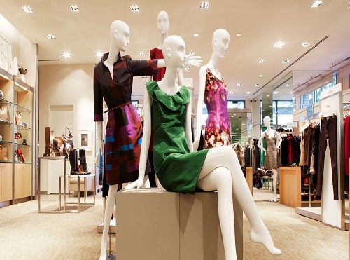
Mitchell Stores is an independent luxury apparel retailer operated by second- and third-generation members of the Mitchells family. Founded in 1958, the business has grown over the years to offer eight locations across four brands.
Mitchells was looking for across-the-board growth for the e-commerce portion of its business while developing a hyper-local messaging approach that promoted each brand to the appropriate geographic audience. It was critical for us to show a strong return on their advertising investment and contend with brand-specific requirements. Most importantly, Mitchells needed to overcome challenges facing the luxury retail space as a whole.
As shoppers have become more Omnichannel, Mitchells recognized its customers shopped across multiple devices. A typical shopper might begin their search on a device, then switch to another device, or go into the retail location to complete their purchase. Historically, luxury online retailers have found it difficult to track conversions because 70 percent of all retail purchases are completed in-store, regardless of whether the search began in-store or online. Because of this, Mitchells was looking to better understand the relationship between the online and offline activity of its customers.
Competition in this space is fierce. With large brands such as Macy’s, Neiman Marcus, Bergdorf Goodmans, Barneys and Bloomingdales each vying for the same audience, these companies’ big budgets can often overshadow those of smaller companies such as Mitchells.
Mitchells resisted selling on Amazon, feeling the online giant wasn’t on-brand. But, with Amazon accounting for an ever-increasing share of the retail market, they’re hard to ignore.
Other issues Mitchells had to contend with included low inventory on unique products – often, single items would only have a handful of sizes available. Luxury retail is a unique mix of “I want it now” wealthy Millennials and long-consideration purchase customers. It often takes 12 or more touchpoints to get to a conversion on the site.
Mitchells’ final concern was that it hoped to create the same luxury experience for its customers online as they had become well-known for in-store, including the promotion of the retailer’s expert style advisors.
As a Google Premier Partner, Noble routinely turns to the power-packed suite of Google products to solve problems for clients like Mitchell Stores. Mitchells is heavily focused on revenue growth and held our team to an expectation of a >70 percent increase in year-over-year traffic, conversions and revenue. To Mitchells, success was absolutely in the numbers.
However, Mitchells also had strong brand guidelines, protecting each brand within its luxury store group: Mitchells, Wilkes Bashford, Richards and Marios.We structured the Mitchells account campaigns to target each local geo around a specific brand store using DMA Regions for the larger geos, and zip code and radius targeting for the more remote locations. This meant we could differentiate search behavior between the separate locations and maximize keyword performance and ROI. We could also apply ad extensions on a local level to complement in-store events, such as trunk and fashion shows. Mitchells individual locations are one of four different brands that stand alone and are promoted as a unique brand, rather than Mitchell Stores. This required tight geo-targeting and unique messaging per geography and per store brand.To remain competitive, we understood that our account had to be as efficient as possible to in order maximize the budget we had against the larger corporations bidding alongside. We adopted complex bid adjustments to demographics based on performance data, device, geography and layered in Remarketing Lists for Search Ads (RLSA) to capture that multi-touch user. In addition, we used day parting to ensure we were visible at the most valuable times of the day.We launched a Google shopping campaign, increasing Mitchells’ digital footprint to a national scale and drawing in new customers who weren’t previously aware of Mitchells’ brands. We optimized its feed’s leveraging custom labels to drive optimal performance from this campaign, knowing that this audience would not relate to the brand, but rather to the designer they were purchasing.We created a custom tracking document and dashboard for the client that imported numbers from their internal sales system so we could blend them with our numbers from Google Analytics. We shared transaction IDs from click conversions and used these numbers to determine if the sale was from a new or returning customer. From this, we could assign value to the paid effort based on the Lifetime Value (LTV) of each customer we drove to a website conversion. This enabled the client to understand the value of new customer acquisition and, in turn, allowed us to understand the business further, factoring in additional business costs and returns for an accurate ROI estimate. We also created models accounting for multi-touch and view through conversions to allow the client to pivot their strategy as needed.
Noble Studios very quickly connected with the passion and dedication of the Mitchells team and brand. These values compliment Noble Studios’ mission to empower continuous curiosity, inspire great work and build meaningful connections. To this day, we use both Mitchells branding and Noble values as a guiding light. Although there were many digital challenges facing the industry and brand, we knew that with our expertise and a little of creativity, we could overcome and see great results.
To Noble, the most important aspect of the campaign was understanding the client’s business and what success looked like for them. We invested heavily upfront so we would have a well-informed plan and would be able to pivot wisely using our agile marketing methodology. This created a true north for us and made decision making and prioritization more effective.
In our first year of engagement with Mitchells, the client saw the following growth in paid search performance:Then, in the second year of our engagement, year-over-year revenue growth continued with:Noble has implemented a strategic approach to Mitchells’ AdWords account structure that encompasses all individual Mitchell brand requirements, targeting an audience closer to their stores via DMA regions and radius targeting. We’ve also grown Mitchells’ national footprint through the development and implementation of a national Google shopping campaign. With this, we drove 62,385 new visitors to the site during the past year. In fact, 78 percent of paid traffic consisted of new visitors.
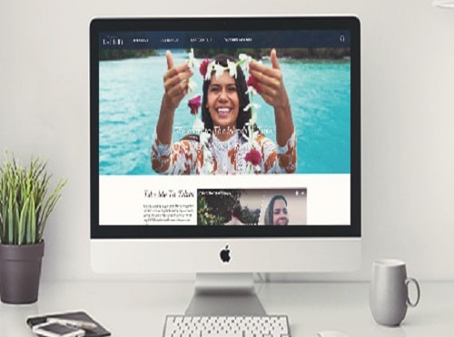
As one of the top 10 destinations in the world, The Islands of Tahiti has no trouble drawing vacationers to their little patch of tropical paradise. In fact, nearly 200,000 people visited these far-flung South Pacific islands in 2016, representing a 17 percent increase over the previous three years.
But even the best of things can benefit from a little improvement.
Tahiti Tourisme, the Polynesian country’s official destination marketing organization, sought to drive visitors to more of its islands, including those off the beaten path, while increasing visits to stakeholder businesses in the process. Tahiti also hoped to broaden its reach by expanding its digital presence to 18 different countries. The end goal? To increase the average length of stay by appealing to a more global audience and boost the number of vacation packages sold by tour operators.
At Noble, we’re always excited to tackle new projects, but to launch a new site for an entire country with language personalization across 18 regional sites was a really big deal, to put it mildly. With deep experience in the travel and tourism and digital marketing verticals, Noble Studios took on the task of creating a new website that visually showcased The Islands of Tahiti’s refreshed brand, also giving individual stakeholders more control over their content.
Noble StudiosUndertaking nearly a year of extensive planning, research and stakeholder input, we began overhauling the look and feel of TahitiTourisme.com. Inspired by the Polynesian concept of Mana, the life force infused throughout the region, we sought to better educate potential visitors on the cultural and geographic differences found in Tahiti’s 118 islands.
The Islands of Tahiti
We drew further inspiration from the organic textures and patterns of Tifaifai, the woven, patterned garments found in Polynesia along with gorgeous imagery from the islands, showing their majestic beauty. Words we used to drive our designs included “exhilarating,” “humble spirit” and “generous,” all direct reflections of the people and places that make up The Islands of Tahiti.
Appropriately, blue is the brand’s primary color, inspired by Tahitian tattoo ink, illustrating the powerful and mystical Mana of Tahiti. We used green to contrast the blue and represent a richness and beauty of the region’s diverse landscape and flora.
We developed new pages that provided relevant, highly-searched information as part of the SEO strategy, which we executed in two ways. During the site redesign, we optimized copy on each island’s landing page, helping distinguish the smaller, overlooked islands from the more visited ones. This not only helped with organic rankings, but showed potential travelers the diversity of culture and experiences a visitor to Tahiti can experience.
We also crafted an ongoing series of blog posts for the islands, targeting specific search phrases or commonly asked questions about the islands, such as “How long does it take to fly to Tahiti?” All of these content initiatives contributed to significant increases in organic site traffic. Accompanied by stunning imagery, the content showed potential visitors that there is a perfect island to fit any mood.
Tahiti Mobile Phones
Tahiti Flower
Noble then consolidated each of the regional domains (.fr for France, .ca for Canada, etc.) into a single, consistent look and feel while still appealing to a geographic niche. Content siloing further helped deliver content in a more impactful way to visitors. In the end, we launched 18 regional sites for The Islands of Tahiti in a variety of languages and locations from Asia to South America and all points in between.
Finally, there was the issue of stakeholder businesses needing more control over their content. For this, we turned to Simpleview, a Customer Relationship Management platform that gives The Islands of Tahiti the ability to maintain a single data source which is automatically updated on the website. This helps reduce duplication of efforts. Each stakeholder – from tour operators to guesthouse owners – can now log in and manage its own content and have it deployed across all 18 sites.
Tahiti is unique in another aspect: all vacations must be booked through officially approved travel agents. With the ability manage more of their content, these agents can better target potential visitors by offering specialty vacation packages such as golfing, diving and sightseeing experiences.
Noble Studios
From a search standpoint, our Strategic Services team worked through an extensive SEO process to gain additional exposure to potential visitors at various stages of the buyers’ journey, allowing for a more personalized planning experience for those considering a trip to The Islands of Tahiti.Since launch, the site has provided an updated, responsive user experience that reflects the needs of stakeholders and prospective visitors alike. Site conversions are up across the board, including organic and social, while the site’s technical SEO health score has improved dramatically. Best of all, TahitiTourisme.com has seen a 344 percent increase in goal conversions YoY.
MarCom Awards
Best Tourism Website of 2017
Communicator Awards
Award of Distinction 2018
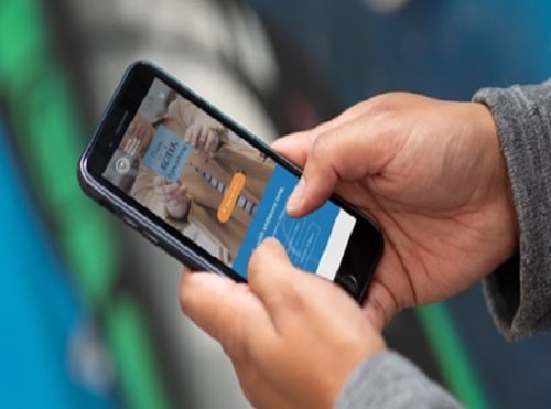
As part of Noble Deeds, our philanthropic arm, dedicating around 1% of our available hours annually to a nonprofit in Nevada, we began an engagement with an incredible organization, Crisis Call Center (their name at the time). They provide support to people in times of crisis through their call center and Sexual Assault Support Services (SASS). This was timely in 2018 with the prominence of the #metoo movement and widely publicized celebrity suicides. It was extremely meaningful to us, and we knew we could profoundly help them help the people they serve.
1. They felt their name was holding them back from helping as many people as they could. They are actually more than a call center that helps people through crisis. They also offer in-person Sexual Assault Support Services. This extremely important part of their organization was being overshadowed because of the name, making it harder to create awareness, tell the story and help all the people they wanted to.
2.Their messaging felt convoluted. When someone landed on their website, it wasn’t immediately clear what they stood for, how exactly they helped people and who they were speaking to. If you spoke to their team, you felt the meaning of their mission and the passion to make it happen, but it took a lot to tell the story.
3.They needed to update their out-of-date visual identity. Because they had been busy pouring energy into helping people, which is obviously what’s most important, they hadn’t had time or resources to evolve their visual identity. So their logo and overall look were actually undermining the legitimacy of this crucial organization.
4.Their website was underperforming. Much like their visual identity, the architecture, UX and technology of their website was out of date. The organization of the information needed to be streamlined, the experience honed for specific audiences and the performance improved for speed and search.
5.They needed more awareness, so they could find more sources of funding, sign up more volunteers and ultimately help more people in crisis.
To help Crisis Call Center evolve their name, stand out and clearly communicate what they stand for and how they truly help people, we took them through our YOU-X-POSITIONING process. This led to a new name, a brand platform, messaging and visual identity that’s more reflective of who they are.
To help Crisis Call Center evolve their name, stand out and clearly communicate what they stand for and how they truly help people, we took them through our YOU-X-POSITIONING process. This led to a new name, a brand platform, messaging and visual identity that’s more reflective of who they are.
To help Crisis Call Center evolve their name, stand out and clearly communicate what they stand for and how they truly help people, we took them through our YOU-X-POSITIONING process. This led to a new name, a brand platform, messaging and visual identity that’s more reflective of who they are.In tandem with their team, we came up with a name that would act as an umbrella brand for their current and future services and highlight the fact that they actually serve the entire state of Nevada. It was also important that the name was an evolution, not revolution. They didn’t have the resources to create awareness around a name that was a total departure.We think of our brand strategy process as if we step up to a table full of puzzle pieces. It’s all already there–all the passion, all the brilliance. We just help organizations piece it into an image that inspires and connects with people internally and externally.
We helped define their purpose, personality, pillars, promise and position.
We encouraged them to establish an inspirational and aspirational vision.
And we pulled a key insight from the process that what they really do is help “provide reminders” to people that they matter and “better tomorrows” are possible.
Content—including original video, photo and copy—was created to help two key audiences: those in need of help and those looking for ways to give help. Our designers and copywriters collaborated closely to lay out the pages in a way that ensures visitors can get the information they need quickly and the content is easy to digest especially if someone is in an emotional state.Our content-first website strategy involved SEO guidance for every page we wrote for the new website to ensure people in crisis could find Crisis Support Services of Nevada’s services. To complement the organic approach, we worked with their team to apply for a Google Ad Grant, enabling the nonprofit to run Google Ad campaigns to reach key audiences. We also provided education on paid and organic search best practices to the in-house team, so they were empowered to continue the work we’d done.
In order for Crisis Support Services of Nevada’s employees to spread the word about their services, they needed new business collateral including brochures, business cards and stationery. Brochures for the SASS program and Crisis Support Services of Nevada were designed for those who needed help as well as those interested in supporting the organization through donations and volunteering. Business cards were instantly impactful, helping the executive director as she met with Nevada legislators about critical bills and funding in early 2019.The new Crisis Support Services of Nevada’s brand is very new. We only launched their new website in January of 2019. However, they were able to give people an introduction to the new brand at their annual breakfast in the fall of 2018, unveiling the new name, logo, overall messaging and a brand mantra video. They were able to get a lot of engagement and interactive participation from the attendees by allowing them to craft positive messages to people in crisis.
The 2018 Compassion Through the Crisis breakfast attracted 380 people, 130 more than 2017. As a result of the breakfast, Crisis Support Services of Nevada raised $32,000, an $8,300 increase over the previous year.While the evolution of the Crisis Support Services of Nevada’s brand is still new, we have seen immediate results. Since launch, Crisis Support Services of Nevada secured a $450,000 grant for a substance abuse hotline, and website performance has increased substantially.
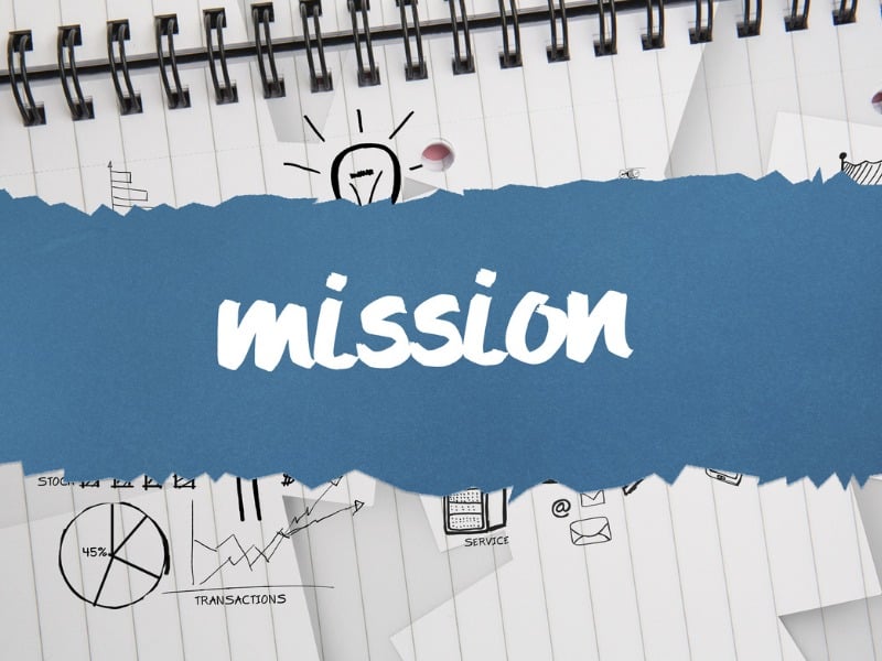
Noble Studios Mission
Ah, the mighty Noblebot. The name started out as a joke, but soon grew into something very real. Back at our old Carson City digs, we had an automated security system that required a username. Because Transformers were so popular at the time, we chose “Noblebots.” It stuck.
The rest, as they say, is history.